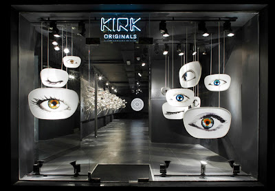
Kirk Originals eyewear company opened its London flagship store on Conduit Street in the West End in early February this year, and I have only just seen the clever in-store design for their launch. London-based Campaign designed the simple, dramatic retail environment for the 66 square-metre boutique, and it looks incredible, and so focused on what the company does. The black-and-white color palette, with only one eyewear wall with 187 “heads” for frames, and practically no furnishings ensure that customers will focus on the eyewear. Eye examinations and fitting take place in the basement, away from the main display space, showing the focus on consumer engagement, but still giving them the privacy to have an eye test and create a personal connection. Large graphics of winking eyes in the window speak clear language, whilst exciting the consumer in a way that would make them go into the store just to check it out, even if they don’t need glasses! Really like this in-store experience, and think more brands should put a focus on making their store’s stand out from the rest as seen in Mary Portas’ new series, of which I particularly liked the programme focused on revitalising the mobile phone market.


Thanks for sharing such a very informative quality content.
ReplyDeleteOptical Showroom in Gomti Nagar
Optical Store in Gomti Nagar